There are actually very good executions of “yellow paint” guiding
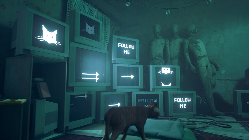
Stray is a good example
Love Stray, but it might not be the best example. It’s not exactly subtle…

Though, you do learn that lots of the hints are actually a robot character named Momo deliberately leading you to Dead City. It’s a great game, but it would be way harder if the environment didn’t light up your path.
Deus ex intensifies
Human Revolution? It’s nothing but yellow.
The explanation they gave at the end of God of War was pretty awesome.
What was it? I didn’t play the game.
It was due to devs hating the player with every ounce of their being. They originally had sharp flashes of red and blue lights every time Kratos solved a puzzle but Sony made them remove it.
Huh? How is this an explanation for the yellow paint on ledges?.
The reason is a spoiler
But they did test without yellow paint, the testers kept getting stuck and complaining.
Feel free to share in a spoiler bracket. I won’t play the game anytime soon.
I’m a fan of the yellow paint or otherwise highlighting of things I can do things to/with over having everything look the same and being required to click everywhere, all the time in order to know what I can, and cannot, interact with.
Playing the original Hitman vs the newest Hitman is such a drastic change not just because of the graphics, but because of little design elements like that. Makes it way easier to plan what you’re gonna do when you know for sure what you can work with.
It also means you’re less likely to miss something in a place you’ve been in and having to come back.
Anyone against highlighting interactables and enemies wasn’t around for games in the 80s-90s. Fucking, why were interactable items and fixtures so common and so goddamn bland?
Sorry, you didn’t flip the hourglass in Morg’s Inn before the end of Chapter 5 so you’re stuck with the 3 terrible ending sequence options. We only put a vague hint about it on page 63 in the instruction booklet.
nothing like playing leisure suit Larry 2 and finding out you have to replay the last 4 hours even though you saved because you didn’t type look in trash can while standing next to the trash can on the first screen of the game


